New Quick App GUI elements for the FIBARO Home Center 3
In this blog, I explain the new button switch type and dropdown list GUI elements available for HC3 Quick App's since system update 5.1.50.
Summary
With system update 5.1.50 FIBARO introduced some new GUI elements for Quick Apps in the HC3. In this blog I’ll show you how they work and how you can control the GUI elements with Lua code examples when you want to write your own Quick Apps.
TL;DR
- Why is my visual Quick App button state not working?
- How to read the button switch on/off status?
- How to read the selected item from a Quick App dropdown list?
- How to add values to a dropdown list with Quick App Lua code?
Which new GUI elements are added in HC3 firmware 5.1.50?
With system update 5.1.50 FIBARO introduced the following new GUI elements for Quick Apps;
- Improved auto-naming of QuickApp elements and labels.
- Added switch support.
- Added dropdown list support.
- Changes for control identifiers.
The full changelog for firmware 5.1.50 you can read at the FIBARO forum firmware topic.
Button switch type explained
If you add a button to the builder section of the Quick App editor, you can now select the type of button you want to use:
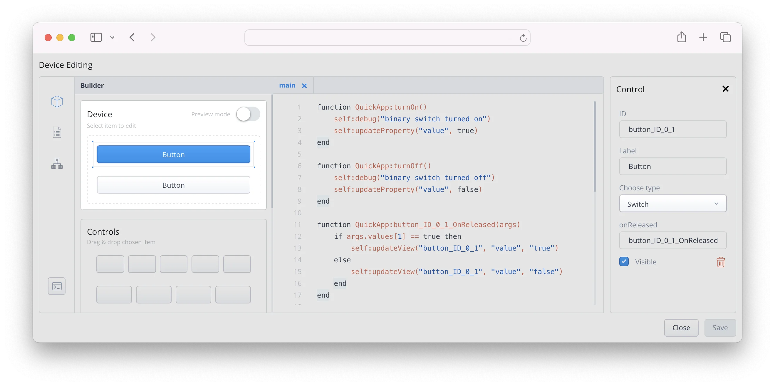
For now I focus on the new switch type. This type creates a button that you can turn on and off. If the button is in on state, it has a blue color (in light mode). In off state it has a grey color, like a normal button.
Only in the Quick App edit preview mode the button switches on and off. You have to program the actual on/off GUI state by yourself!
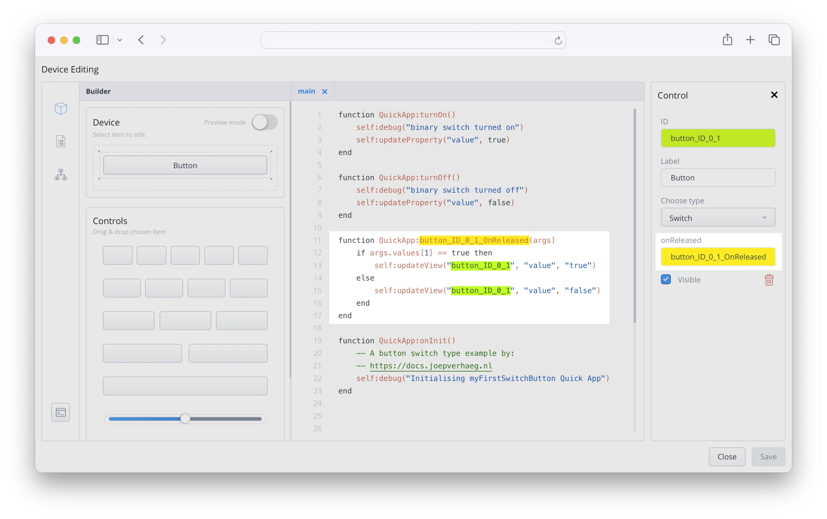
To update the view when clicking on the button you have to read the current state of the button with a onReleased handler function. The following Lua code snippet does the bare minimum when clicking the button you added to the Quick App. It just turns the visual state on and off:
function QuickApp:button_ID_0_1_OnReleased(args)
    if args.values[1] == true then
        self:updateView("button_ID_0_1", "value", "true")
    else
        self:updateView("button_ID_0_1", "value", "false")
    end
end
How the onReleased function handler works
You pass the args argument to the function you defined in the onReleased control box. In this argument the following UI event is generated:
UIEvent: {"values":[true],"eventType":"onReleased","deviceId":24,"elementName":"button_ID_0_1"}
The values parameter is a list object with 1 value (don’t ask me why). It holds a true or false value. To get the first value from the values list object you use the code: args.values[1]. In the end you wrap it in a if condition to update the view in the GUI.
To show you the full picture, I included a screenshot below, showing the Quick App editor with the button, the onReleased handler and the Lua code in the HC3:
A practical Quick App button example
The above example only switches the button visual element to an on or off state. You can write your own logic within the if condition to make your Quick App functional, but to make your code more readable I advise to add two functions:
function QuickApp:button_ID_0_1_turnOn()
    self:debug("button_ID_0_1 switch turned on")
		-- Insert your button turn on logic here...
end

function QuickApp:button_ID_0_1_turnOff()
    self:debug("button_ID_0_1 switch turned off")
		-- Insert your button turn off logic here...
end
In the onReleased handler function you call these two functions within the if condition like:
self:button_ID_0_1_turnOn()
The complete function then looks like this:
function QuickApp:button_ID_0_1_OnReleased(args)
    if args.values[1] == true then
        self:updateView("button_ID_0_1", "value", "true")
        self:button_ID_0_1_turnOn()
    else
        self:updateView("button_ID_0_1", "value", "false")
        self:button_ID_0_1_turnOff()
    end
end
Now when you click the button, the visual GUI element is changed to the correct state and the corresponding on or off functions are called. In these functions you can now program what you want the Quick App to perform when flipping the button status.
Drop down list explained
With system update 5.150 FIBARO also released a drop down list GUI element for a Quick App in the HC3.
If you add the dropdown element to the builder section of the Quick App editor, you can add the values on the right side of the screen:
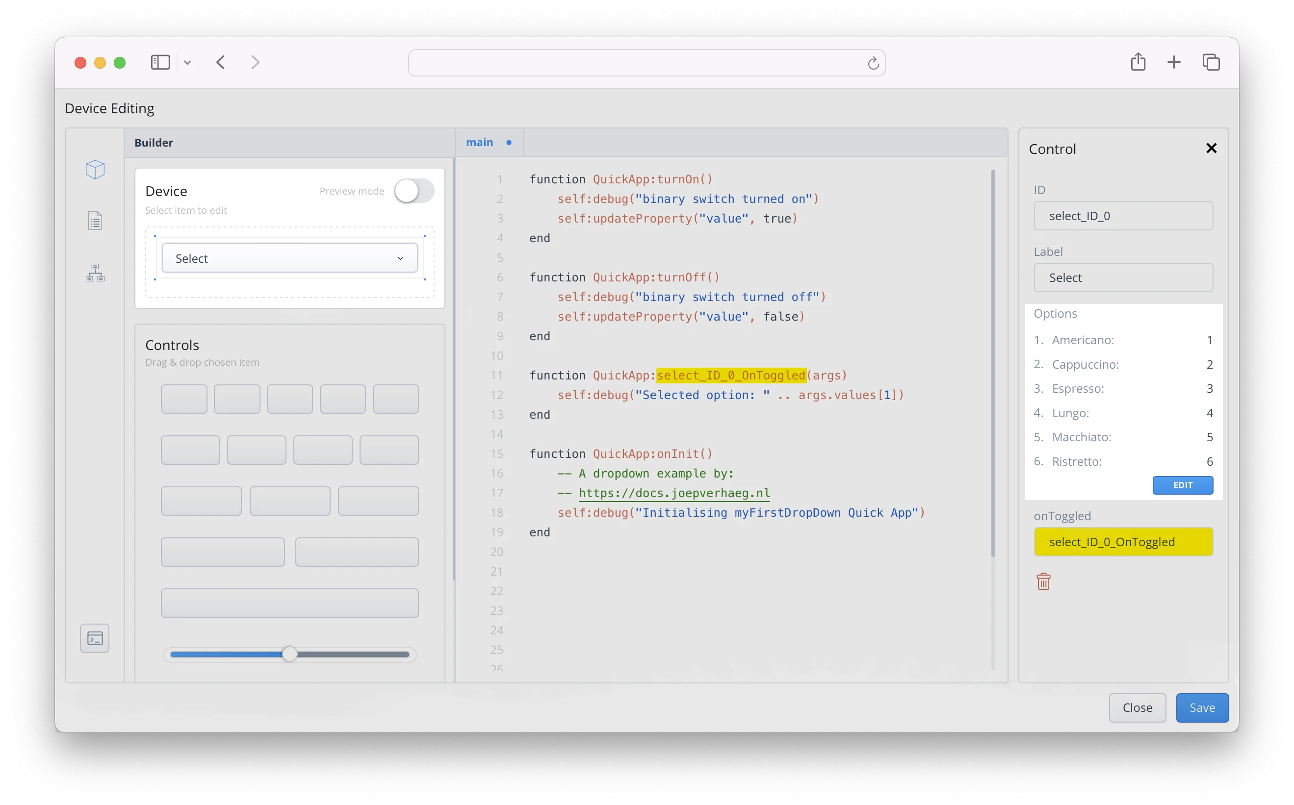
In order for the Quick App to work with the selected value you must program a onToggled handler function that works like you created with button switch type example.
How the onToggled function handler works
As you read earlier with the button switch type, when selecting an item in the dropdown menu, a UI event is generated by the HC3. For example, the following event is generated when you select the Cappuccino option in the example above:
UIEvent: {"deviceId":461, "values":[2], "eventType":"onToggled","elementName":"select_ID_0"}
The values parameter is a list object with 1 value (again, don’t ask me why). You see the value 2 here, which belongs to the dropdown item Cappuccino.
To determine which item is selected in the dropdown list you define an onToggled handler function and read the arguments passed to it. To show the selected value in the HC3 debug log you can use the following code:
function QuickApp:select_ID_0_OnToggled(args)
    self:debug("Selected option: " .. args.values[1])
end
With this method you can easily send the correct command to your Bosch/Siemens coffee machine by sending the correct parameters to the appliance you want to control.
How to add dropdown values with Lua code
Sometimes you want to dynamically generate the items in a dropdown list. For example if you read data from another device API and want to use the items you retrieve in a Quick App dropdown list.
To add the dropdown items with lua code, you have to create a table with the parameters in the following format:
dropdownOptions = {
    {text = "Doppio", type = "option", value = "1"},
    {text = "Flat White", type = "option", value = "flatWhite"},
    {text = "Latte", type = "option", value = "coffee_latte"}
}
self:updateView("select_ID_0", "options", dropdownOptions)
In the example above I created 3 dropdown items:
Doppiothat returns the value1when you click on it;Flat Whitethat returns the valueflatwhitewhen you click on it;Lattethat returns the valuecoffee_lattewhen you click on it.
If you put the above code in a function, it updates the dropdown menu when the function runs.
Update the currently selected item
When you add the dropdown items with lua code there is no default item set. You can easily set the default item with the following line of code:
self:updateView("select_ID_0", "selectedItem", "coffee_latte")
Note that you use the value from the table your created earlier to set the selected item.
Expert example
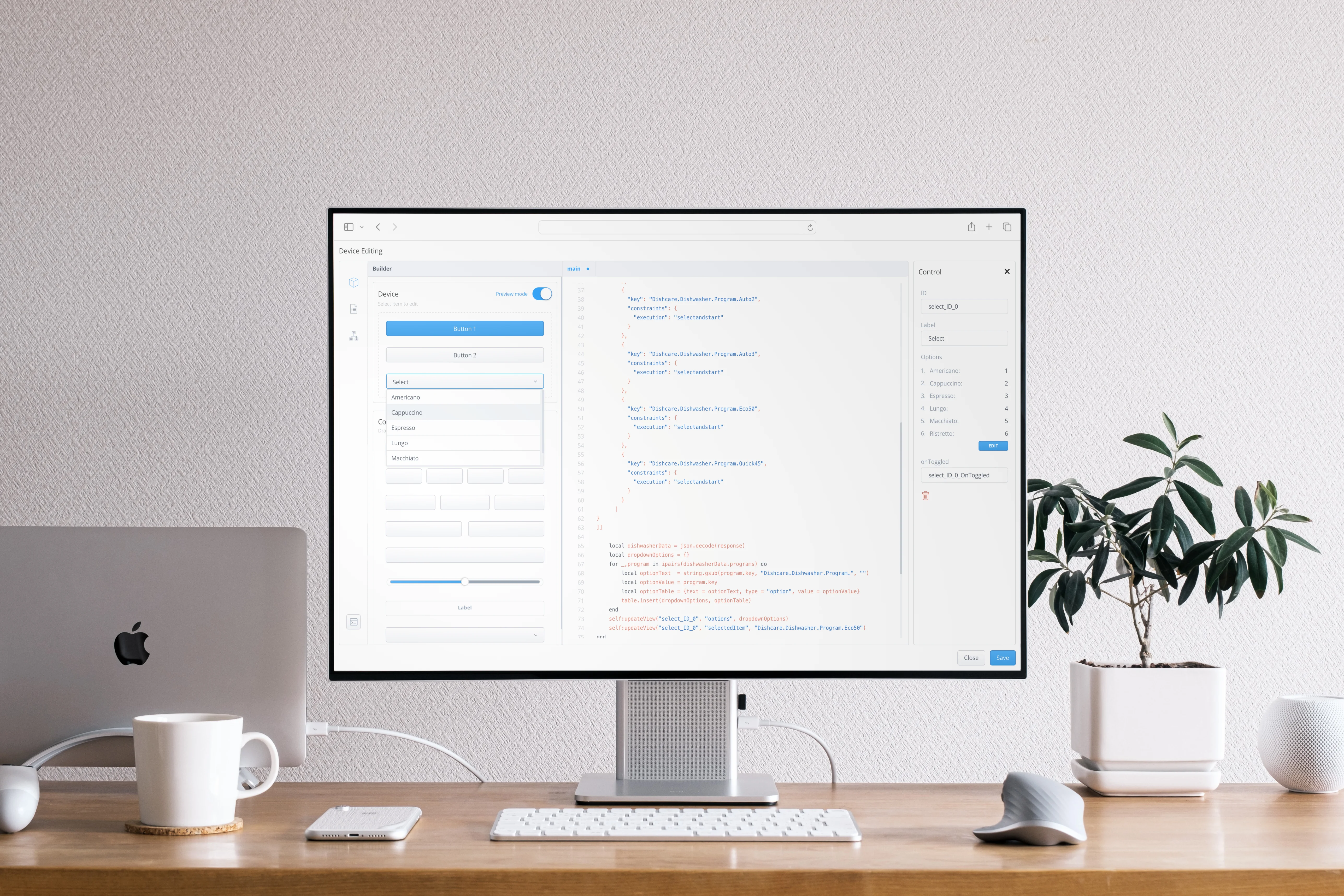
In this example I’ll show you how to transform the retrieved JSON output with the available dishwasher programs retrieved from the Home Connect API.
To make the text more readable I only show the programs key from the JSON output here, that you are going to use in this example:
{
"programs": [
        {
          "key": "Dishcare.Dishwasher.Program.Auto1",
          "constraints": {
            "execution": "selectandstart"
          }
        },
        {
          "key": "Dishcare.Dishwasher.Program.Auto2",
          "constraints": {
            "execution": "selectandstart"
          }
        },
        {
          "key": "Dishcare.Dishwasher.Program.Auto3",
          "constraints": {
            "execution": "selectandstart"
          }
        },
        {
          "key": "Dishcare.Dishwasher.Program.Eco50",
          "constraints": {
            "execution": "selectandstart"
          }
        },
        {
          "key": "Dishcare.Dishwasher.Program.Quick45",
          "constraints": {
            "execution": "selectandstart"
          }
        }
      ]
}
To add these values to a dropdown box you need to:
- Loop though the programs;
- Remove the
Dishcare.Dishwasher.Program.text from thekeyvalue to make the dropdown option text more readable; - Create a dropdown table in Lua;
- Add a dropdown table item for every program item;
- Add the table to the dropdown GUI element;
- Set the
Eco50program as default option.
Let’s assume that the HTTP API response is saved in a JSON string in the response variable. With this in mind, the code to add the dishwasher programs to a Quick App dropdown box looks like:
local dishwasherData = json.decode(response) -- convert the JSON into a Lua table
local dropdownOptions = {} -- Create a new empty table
for _,program in ipairs(dishwasherData.programs) do
    -- Strip the Dishcare.Dishwasher.Program text from the key with the string.gsub() function
    local optionText  = string.gsub(program.key, "Dishcare.Dishwasher.Program.", "")
    local optionValue = program.key
    local optionTable = {text = optionText, type = "option", value = optionValue}
		-- Add the item to the dropdownOptions table
    -- You nest the optionsTable in the dropdownOptions table
    table.insert(dropdownOptions, optionTable)
end

self:updateView("select_ID_0", "options", dropdownOptions)
self:updateView("select_ID_0", "selectedItem", "Dishcare.Dishwasher.Program.Eco50")
If the above code has been executed by the Quick App, your device will look like this:
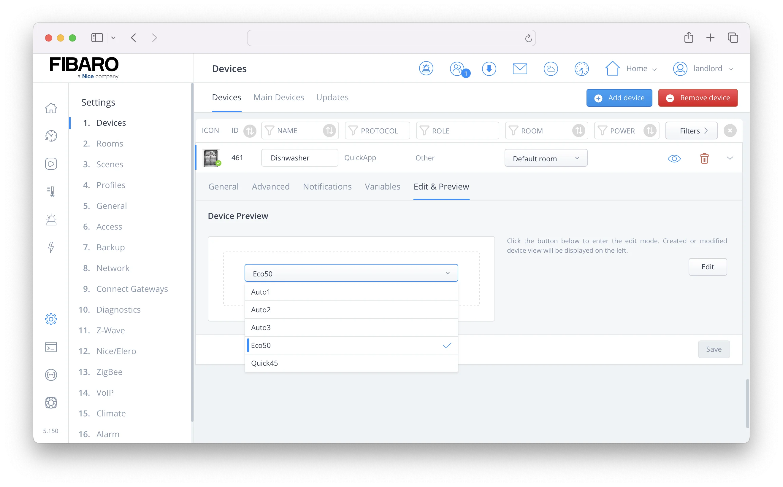
As you can see, the Eco50 option is checked because you set the selectedItem property in the Quick App code.
Credits: Title Photo by Sora Sagano on Unsplash
Explore more like this
Window/Door Notifier QuickApp for HC3
We all like fresh air, but if the windows are open for too long, you are wasting energy because your HVAC is heating up the rooms for nothing.

Why I use Shelly next to my FIBARO devices in my smart home
Building a smart home can be overwhelming with so many devices and protocols to choose from. In this blog, I’ll share my experience why I use Shelly next to my...
What I’m Running: HC3 connected to Home Assistant - Tuya & Android TV
Tuya smart lights are difficult to integrate with the Home Center 3 (HC3). While some integrations exist on the FIBARO forum, they’re cumbersome to set up and result in a...